


Data Visualization in Excel by Using ExTool

Data Visualization in Excel by Using ExTool
MP4 | Video: AVC 1280x720 | Audio: AAC 44KHz 2ch | Duration: 1.5 Hours | Lec: 27 | 273 MB
Genre: eLearning | Language: English
MP4 | Video: AVC 1280x720 | Audio: AAC 44KHz 2ch | Duration: 1.5 Hours | Lec: 27 | 273 MB
Genre: eLearning | Language: English
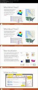
Now that you've conquered basic Excel functions, it's time to transform your data into beautiful visualizations!
This course will teach students how to master their Excel skills by learning both basic and extended data visualization and business intelligence related functions using the ExTool Application. In the first section of the course, students will learn how to create the following data visualizations: 3D Surface Plot, Force Arrow Chart, Plot Pins on a Google Map, Plot Data on a Google Map, and Biomedical Batch Analysis Chart, Loss Analysis Chart, Scatter Plot, Multiple Stock Analysis Chart, Risk Analysis Map. The second section of the course will demonstrate the following functions: Air Quality Heat Map, Candlestick Chart, Stacked Area Line Chart, Colored China Air Quality Chart, Multiple Funnel Chart, Basic Radar Chart, Bar Negative Chart, Sized Pie Chart, Migration Map, Sankey Diagram, Stepped Waterfall Chart, and Funnel Align Chart. Through the mastery of these functions, users will be able to transform their data into beautiful, animated graphics that are easy to work with and understand.
Data Visualization in Excel by Using ExTool
