


Learning Path: Real-World Web Design by Erol Staveley - Curator (2016)

Learning Path: Real-World Web Design by Erol Staveley - Curator (2016)
WEBRip | English | MP4 | 1280 x 720 | AVC ~502 kbps | 25 fps
AAC | 128 Kbps | 44.1 KHz | 2 channels | 07:03:53 | 2.47 GB
Genre: eLearning Video / Web Development, Programming
WEBRip | English | MP4 | 1280 x 720 | AVC ~502 kbps | 25 fps
AAC | 128 Kbps | 44.1 KHz | 2 channels | 07:03:53 | 2.47 GB
Genre: eLearning Video / Web Development, Programming
The pressure to make every user experience unique and engaging is only going to rise as UX innovation raises the bar. Stay updated on the latest design tips and techniques and apply them to your own work straight away with this practical Learning Path.Prerequisites: A core understanding of HTML and CSS syntax
Resources: Code downloads and errata:
Responsive Web Design – From Concept to Complete Site
Responsive Web Design: Advancing your Design to the Modern Web
UX Design for Web Developers
Building a Responsive Website with Bootstrap
This path navigates across the following products (in sequential order):
Responsive Web Design – From Concept to Complete Site (2h 04m)
Responsive Web Design: Advancing your Design to the Modern Web (2h 31m)
UX Design for Web Developers (3h 44m)
Building a Responsive Website with Bootstrap (1h 56m)
Chapter 1 : Responsive Web Design - From Concept to Complete Site
Exploring Responsive Web Design (RWD)
Understanding the Use of RWD
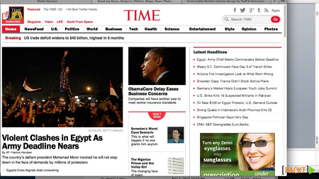
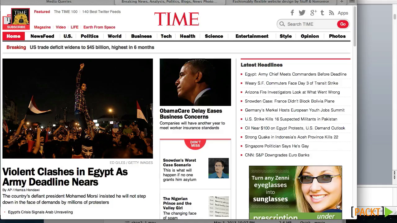
Examples of Adaptive Layouts
Device Breakpoints
Pros/Cons of RWD
Course Overview
Fluid Width Layouts
Working with Percent Width Layouts
Examples of Fluid Layouts
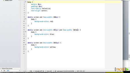
Media Queries
Media Query Code
Testing a Simple Media Query
Best Practices for Media Queries
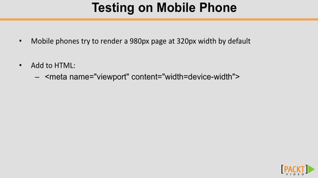
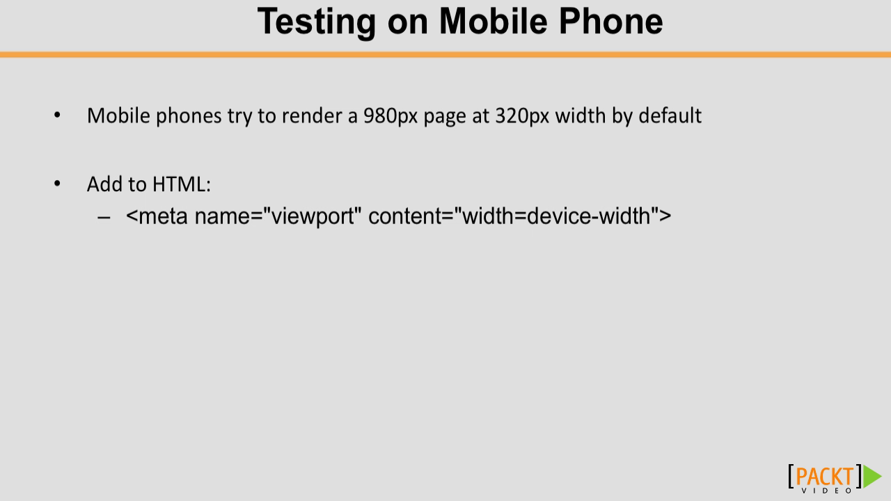
Testing Media Queries on Actual Mobile Devices
Using RWD Demo Files
Using Sample Files
Overview of the HTML Structure for the Demo Site
CSS Resets and HTML5
HTML for Container, Header, and Navigation
HTML for a four Column Content Area
HTML for a two Column Footer
Using Demo CSS for our Site
Writing the CSS for the Navigation Bar and Logo
Building the CSS for Navigation and its Elements
Tweaking the Navigation Using the Inspect Element
Formatting the Header
Styling the Columns
Formatting Headings and Images in the Columns
Formatting the Footer
Tweaks and Fixes to the Body Layout
Planning for Media Queries
Tablet Media Query for the Body
Using Media Query for the Navigation Bar and Logo
Using Media Query for the Navigation Bar and Logo for Devices Smaller Than the Tablet
Using Media Query for Columns to Reorient Horizontally
More on Column Queries and Footer
Final Tweaks for Phone-Sized Devices
Advanced Features/Considerations
Dealing with Font Size EMs
Using Percent-Based Fonts and Dealing with Problems with EMs and Percent
Demo of EM and Percent-Based Font Sizes
Solution to Issues with REMs
Future Considerations: VM, VH, VMAX, and VMIN
Current Solutions to Text Size Issues and Responsive Background Images
Using Background Images, Adaptive Images, and Bandwidth
Responsive Grids
CSS Pre-processors
Chapter 2 : Responsive Web Design: Advancing your Design to the Modern Web
The Course Overview
What Are Media Queries?
Media Queries "Hello World"
Media Queries Within a CSS File with the @media Rule
Media Query Rule Combination
What Is Responsive Design?
Optimizing for a Specific Device
Creating Responsive Designs with Size Ranges
Mobile Responsiveness
Backward Compatibility
Thinking Fluid
Creating a Site That Responds to Itself
Optimizing Based on Device Resolution
Designing by Aspect Ratio
Talking about Color and Grids
What Are Responsive Frameworks?
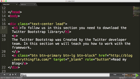
The Twitter Bootstrap
Understanding the Twitter Bootstrap CSS Rules
Adding Components
An Example of a Grid Layout
Changing Themes with LESS
The Future of Media Types
Moving into Media Features
Creating Custom Media Queries
Media Query Operators
Working with Media Query Ranges
Chapter 3 : UX Design for Web Developers
The Course Overview
UX Design Fundamentals
Fundamentals of Building a Website
Essentials of Human-centered Design
Empathy Mapping
Problem Definition- User Flows, Decision Tress, and Screen Flows
Intervention Planning
Understanding the Need for Structure
Structure and Information Architecture
The Essential Elements
Design Patterns – Don't Reinvent the Wheel
SERPS as Home Pages and Location-free Browsing
Landing Pages, Templates, and Page Clustering
Responsive Web Design
Wireframing
Building Your Setup
Home Page Wireframes
Envisioning an Information Ecosystem
Formatting Pages and Content Chunking
Creating Interactions
Media Types
Media Annoyances
Using Graphics
Discuss Best Practices in UX Design
Mobile Best Practices
Desktop Best Practices
Usability
Applying Usability to the Home Page
Wireframe Your Mobile Screen
Wireframe Your Tablet Screen
Wireframe Your Desktop Screen
Wireframe Setup for Prototyping
Flushing Out Your Wireframes
Connecting and Building Your Clickable Prototype
LEAN User Testing
Test Your Prototype
Validate and Iterate Your Prototype
UX Course Review
Chapter 4 : Building a Responsive Website with Bootstrap
Introduction
Downloading and Setting Up Files
Integrating Twitter Bootstrap
Getting Started with LESS
The Home Page Part 1 – Building the Home Page
The Home Page Part 2 – The Slider
The Home Page Part 3 – The Grid
The Home Page Part 4 – Call to Action and Features
Completing the Home Page
Adding Styles – Part 1
Adding Styles – Part 2
Additional Page Types and Styles
Setting Up PHP Includes – Part 1
Setting Up PHP Includes – Part 2
Review our Website
Deploy Our Project
Exploring Responsive Web Design (RWD)
Understanding the Use of RWD
Examples of Adaptive Layouts
Device Breakpoints
Pros/Cons of RWD
Course Overview
Fluid Width Layouts
Working with Percent Width Layouts
Examples of Fluid Layouts
Media Queries
Media Query Code
Testing a Simple Media Query
Best Practices for Media Queries
Testing Media Queries on Actual Mobile Devices
Using RWD Demo Files
Using Sample Files
Overview of the HTML Structure for the Demo Site
CSS Resets and HTML5
HTML for Container, Header, and Navigation
HTML for a four Column Content Area
HTML for a two Column Footer
Using Demo CSS for our Site
Writing the CSS for the Navigation Bar and Logo
Building the CSS for Navigation and its Elements
Tweaking the Navigation Using the Inspect Element
Formatting the Header
Styling the Columns
Formatting Headings and Images in the Columns
Formatting the Footer
Tweaks and Fixes to the Body Layout
Planning for Media Queries
Tablet Media Query for the Body
Using Media Query for the Navigation Bar and Logo
Using Media Query for the Navigation Bar and Logo for Devices Smaller Than the Tablet
Using Media Query for Columns to Reorient Horizontally
More on Column Queries and Footer
Final Tweaks for Phone-Sized Devices
Advanced Features/Considerations
Dealing with Font Size EMs
Using Percent-Based Fonts and Dealing with Problems with EMs and Percent
Demo of EM and Percent-Based Font Sizes
Solution to Issues with REMs
Future Considerations: VM, VH, VMAX, and VMIN
Current Solutions to Text Size Issues and Responsive Background Images
Using Background Images, Adaptive Images, and Bandwidth
Responsive Grids
CSS Pre-processors
Chapter 2 : Responsive Web Design: Advancing your Design to the Modern Web
The Course Overview
What Are Media Queries?
Media Queries "Hello World"
Media Queries Within a CSS File with the @media Rule
Media Query Rule Combination
What Is Responsive Design?
Optimizing for a Specific Device
Creating Responsive Designs with Size Ranges
Mobile Responsiveness
Backward Compatibility
Thinking Fluid
Creating a Site That Responds to Itself
Optimizing Based on Device Resolution
Designing by Aspect Ratio
Talking about Color and Grids
What Are Responsive Frameworks?
The Twitter Bootstrap
Understanding the Twitter Bootstrap CSS Rules
Adding Components
An Example of a Grid Layout
Changing Themes with LESS
The Future of Media Types
Moving into Media Features
Creating Custom Media Queries
Media Query Operators
Working with Media Query Ranges
Chapter 3 : UX Design for Web Developers
The Course Overview
UX Design Fundamentals
Fundamentals of Building a Website
Essentials of Human-centered Design
Empathy Mapping
Problem Definition- User Flows, Decision Tress, and Screen Flows
Intervention Planning
Understanding the Need for Structure
Structure and Information Architecture
The Essential Elements
Design Patterns – Don't Reinvent the Wheel
SERPS as Home Pages and Location-free Browsing
Landing Pages, Templates, and Page Clustering
Responsive Web Design
Wireframing
Building Your Setup
Home Page Wireframes
Envisioning an Information Ecosystem
Formatting Pages and Content Chunking
Creating Interactions
Media Types
Media Annoyances
Using Graphics
Discuss Best Practices in UX Design
Mobile Best Practices
Desktop Best Practices
Usability
Applying Usability to the Home Page
Wireframe Your Mobile Screen
Wireframe Your Tablet Screen
Wireframe Your Desktop Screen
Wireframe Setup for Prototyping
Flushing Out Your Wireframes
Connecting and Building Your Clickable Prototype
LEAN User Testing
Test Your Prototype
Validate and Iterate Your Prototype
UX Course Review
Chapter 4 : Building a Responsive Website with Bootstrap
Introduction
Downloading and Setting Up Files
Integrating Twitter Bootstrap
Getting Started with LESS
The Home Page Part 1 – Building the Home Page
The Home Page Part 2 – The Slider
The Home Page Part 3 – The Grid
The Home Page Part 4 – Call to Action and Features
Completing the Home Page
Adding Styles – Part 1
Adding Styles – Part 2
Additional Page Types and Styles
Setting Up PHP Includes – Part 1
Setting Up PHP Includes – Part 2
Review our Website
Deploy Our Project
Release Date: July 2016
More Info: Salepage
also You can watch my other last: Programming-posts
General
Complete name : 03 - Examples of Adaptive Layouts.mp4
Format : MPEG-4
Format profile : Base Media
Codec ID : isom
File size : 8.91 MiB
Duration : 1mn 57s
Overall bit rate mode : Variable
Overall bit rate : 636 Kbps
Writing application : Lavf56.36.100
Video
ID : 2
Format : AVC
Format/Info : Advanced Video Codec
Format profile : High@L4.0
Format settings, CABAC : Yes
Format settings, ReFrames : 5 frames
Codec ID : avc1
Codec ID/Info : Advanced Video Coding
Duration : 1mn 57s
Bit rate : 502 Kbps
Nominal bit rate : 461 Kbps
Width : 1 280 pixels
Height : 720 pixels
Display aspect ratio : 16:9
Frame rate mode : Constant
Frame rate : 25.000 fps
Color space : YUV
Chroma subsampling : 4:2:0
Bit depth : 8 bits
Scan type : Progressive
Bits/(Pixel*Frame) : 0.022
Stream size : 7.04 MiB (79%)
Writing library : x264 core 146 r2538 121396c
Encoding settings : cabac=1 / ref=6 / deblock=1:0:0 / analyse=0x3:0x111 / me=hex / subme=7 / psy=1 / psy_rd=1.00:0.00 / mixed_ref=1 / me_range=16 / chroma_me=1 / trellis=1 / 8x8dct=1 / cqm=0 / deadzone=21,11 / fast_pskip=1 / chroma_qp_offset=-2 / threads=4 / lookahead_threads=1 / sliced_threads=0 / nr=0 / decimate=1 / interlaced=0 / bluray_compat=0 / stitchable=1 / constrained_intra=0 / bframes=16 / b_pyramid=1 / b_adapt=1 / b_bias=0 / direct=1 / weightb=1 / open_gop=0 / weightp=2 / keyint=50 / keyint_min=20 / scenecut=40 / intra_refresh=0 / rc_lookahead=40 / rc=abr / mbtree=1 / bitrate=461 / ratetol=1.0 / qcomp=0.60 / qpmin=10 / qpmax=50 / qpstep=4 / vbv_maxrate=2500 / vbv_bufsize=5000 / nal_hrd=none / filler=0 / ip_ratio=1.41 / aq=1:1.00
Audio
ID : 1
Format : AAC
Format/Info : Advanced Audio Codec
Format profile : LC
Codec ID : 40
Duration : 1mn 57s
Duration_LastFrame : -20ms
Bit rate mode : Variable
Bit rate : 128 Kbps
Maximum bit rate : 2 500 Kbps
Channel(s) : 2 channels
Channel positions : Front: L R
Sampling rate : 44.1 KHz
Compression mode : Lossy
Delay relative to video : 80ms
Stream size : 1.80 MiB (20%)
Screenshots
Learning Path: Real-World Web Design by Erol Staveley - Curator (2016)
Learning Path: Real-World Web Design by Erol Staveley - Curator (2016)
Learning Path: Real-World Web Design by Erol Staveley - Curator (2016)

Learning Path: Real-World Web Design by Erol Staveley - Curator (2016)


Learning Path: Real-World Web Design by Erol Staveley - Curator (2016)

Exclusive eLearning Videos ParRus-blog ← add to bookmarks

Learning Path: Real-World Web Design by Erol Staveley - Curator (2016)
