
Udemy - Mobile First & Responsive Web Design: Build modern websites!
Udemy - Mobile First & Responsive Web Design: Build modern websites!
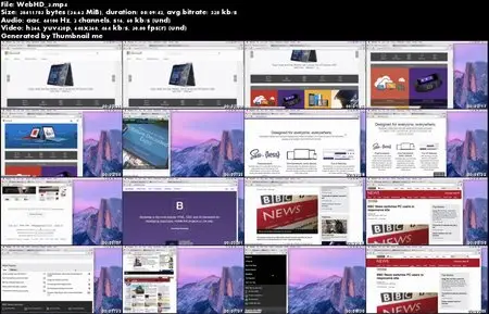
MP4 | Video: 640x360 | 60 kbps | 44 KHz | 576 MB
Genre: eLearning | Language: English
MP4 | Video: 640x360 | 60 kbps | 44 KHz | 576 MB
Genre: eLearning | Language: English
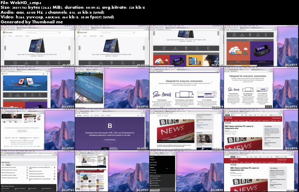
There has never been a better time to learn responsive web design and take a mobile first approach.
Smartphone and tablet users no longer accept that they should have a poor web browsing experience because of the device they are using. Catering for mobile users is now essential.
This course teaches you how to put your HTML & CSS skills to great use by creating mobile first and responsive websites, which look great on any device.
This course covers:
We will go over what responsive design is and why a mobile first approach can be beneficial
Tools you can use to help your project
Fluid grids and relative sizes
The Viewport Meta Tag
Media queries and breakpoints
Building a responsive website project from scratch, using a responsive grid
We will then add jQuery plugins to the project to create a responsive sliding carousel and social sharing buttons
Dealing with responsive images and the picture element
How to optimise our images and files
CSS Flexbox including building our own basic grid
Using responsive frameworks such as Bootstrap
This course is beginner friendly but at least a basic HTML & CSS knowledge is required.
The web is going mobile, make sure your websites are ready!
What are the requirements?
A basic computer knowledge.
A basic knowledge of HTML & CSS.
What am I going to get from this course?
Over 34 lectures and 4.5 hours of content!
Understand what responsive design it and why it is important.
Produce websites using fluid grids.
Adopt a mobile first approach to design to make sure the user experience is the same regardless of the device size.
Use relative units confidently to improve responsive design.
Add the viewport meta tag to your projects.
Understand and be able to apply media queries and breakpoints.
Confidently build a responsive website from scratch or by using a framework.
Add responsive jQuery plugins such as sliding carousels and social share buttons.
Include the picture element to serve the correct size images for the users device.
Improve website performance and page loading times.
Improve page layout using the CSS Flexbox
Overcome common design problems using the Flexbox.
Use Bootstrap framework for creating responsive, mobile first websites.
Create a responsive jQuery drop down menu.
Learn how to use jQuery Mobile to build touch optimised mobile websites.
What is the target audience?
This course is beginner friendly, however you should have some HTML & CSS experience, I will be trying to concentrate on the responsive elements rather than explain HTML & CSS in detail.
You should take this course if you are new to responsive design or need to fill in some gaps.
This course is not intended for experts or experienced web designers/developers.
This course may also be useful for anybody looking to learn modern techniques such as dealing with different images sizes to suit different devices, CSS flexbox or even to gain a better understanding of responsive frameworks such as Bootstrap.
Udemy - Mobile First & Responsive Web Design: Build modern websites!