
Typography Priorities and Pitfalls for Motion Graphics

Typography Priorities and Pitfalls for Motion Graphics | 228 MB
58m 6s | Video: AVC (.mp4) 1280x720 30fps | Audio: AAC 32KHz 1ch
Genre: eLearning | After effects | Project Files Included | September 10, 2014
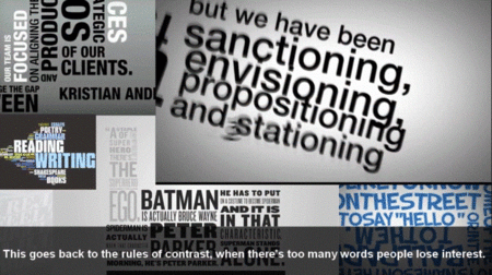
In this series of tutorials, we'll learn some of the common issues to avoid and some of the best approaches you can take to create beautiful motion graphics, specifically in the kinetic typography space. We’ll learn which questions are the most important questions to ask when beginning the work and how these will ultimately help us to make the best decisions for the piece later on. We’ll learn how the method of delivery or the device that the piece will be viewed on makes a difference in the choices we should be making as designers. We begin to explore the concept of less being more when it comes to everything from writing fewer words of the script to using fewer typefaces.
Typography Priorities and Pitfalls for Motion Graphics

Typography Priorities and Pitfalls for Motion Graphics
