

Twitter Bootstrap in Responsive Web Design

Twitter Bootstrap in Responsive Web Design
MP4 | Video: 958x720 | 58 kbps | 44 KHz | Duration: 4 Hours | 555 MB
Genre: eLearning | Language: English
MP4 | Video: 958x720 | 58 kbps | 44 KHz | Duration: 4 Hours | 555 MB
Genre: eLearning | Language: English
Twitter Bootstrap is “sleek, intuitive, and powerful front-end framework for faster and easier web development.”
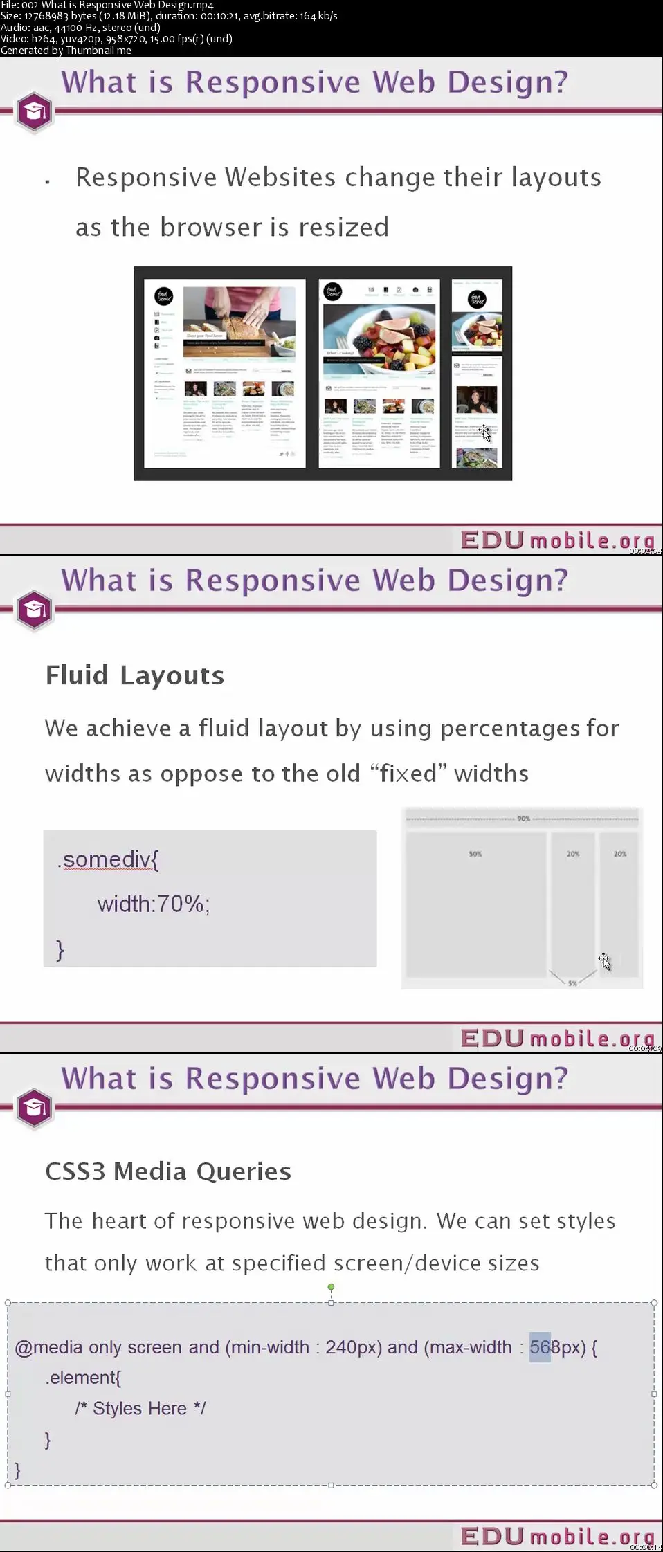
Responsive web design is a challenge to the designer / developer. Its a challenge because you have to change the way you think when you're going responsive and again its a daunting task to make it attractive on multiple screens. The basic idea behind it is looking the same on desktop, tablet and phone. Responsive Web Design is providing the user with best viewing experience of a website across devices of various sizes. For example, if you are viewing a website on a computer monitor and then viewing it on a smart phone, whose screen size is smaller than a computer monitor, enabling responsive design features on that website gives a smooth view of the website in both the screens.
Our course which covers over four hours of high quality video content explains the basic of how to apply responsive design feature into your web layout moreso with the subject of Twitter Bootstrap. Twitter Bootstrap was created by two guys at Twitter who wanted to speed up and bootstrap their workload and code. If you visit the home page of Twitter Bootstrap they define it as: “sleek, intuitive, and powerful front-end framework for faster and easier web development.” which is a fact! The course covers the Bootstrap overview, Navigation bar, HTML5, Grids etc.
Twitter Bootstrap in Responsive Web Design